

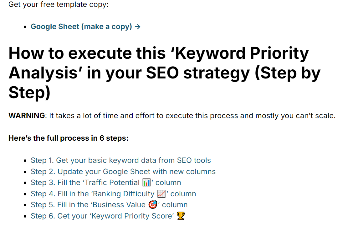
Don’t have time to read the guide at this moment? Bookmark this page and make a copy of this Blog design checklist.
This is the ULTIMATE guide to optimizing your blog to improve:
- Content experience
- SEO performance, and
- Conversion rate to generate leads and product sales
At our SEO agency (Accrue SERP), we use the same strategies to optimize blog content and drive qualified leads for our clients.
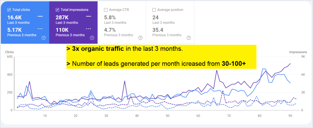
Here’s one example where we tripled the number of qualified leads for an IT training business:
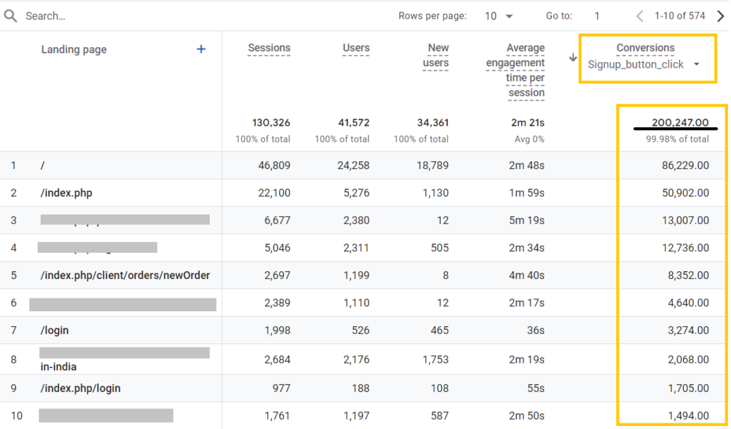
Another example where our blog design strategies helped to generate 200,247 CTA clicks in one month:
Blog design best practices at a glance:
1. A quick playbook to write blog introduction for conversions and time to value
The introduction should tell the readers about the purpose of the article/webpage and what benefits/information users will get after reading the article.
Two types of introduction to use:
- Introduction for top-of-the-funnel articles
Think of the introduction as a quick way of informing ‘who is this article for’ and ‘why they should read this.’
- Write a short and concise blog introduction under 80-100 words max.
- Don’t add unnecessary statistics (add only if it makes sense), stories, & fluff in the introduction.
Here are three examples:

- Introduction for bottom-of-the-funnel keywords
BOFU pages are more likely to generate leads and conversions for clients. So, writing the same generic introduction doesn’t make sense.
So, your goal should be aligning business offerings and blog topics and connecting them with social proof or past results (numbers from case studies).
Below, I have added some examples of blog introduction that builds trustworthiness and integrate social proof for business offerings 👇
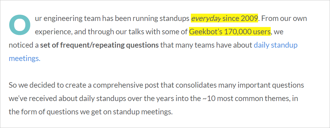
(Article topic: daily standup meetings)

(Article topic: Java course syllabus)
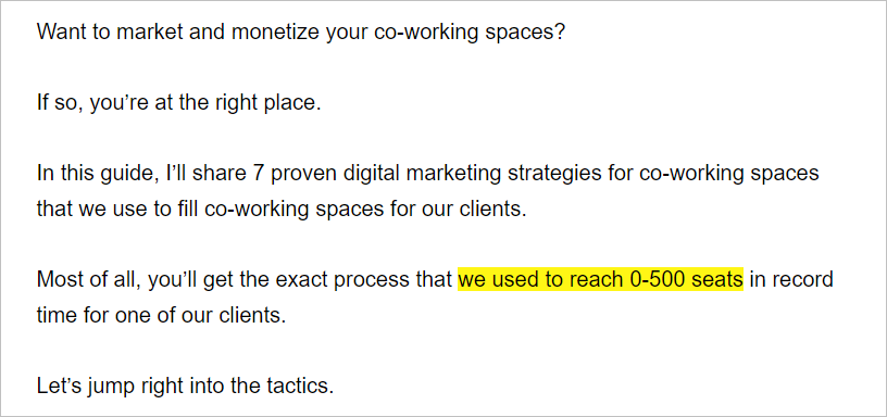
(Article topic: Digital marketing for co-working spaces)
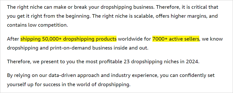
(Article topic: Dropshipping niches)
Each of the above introductions gives you a sense of why I should trust this information and also it mentions the business offerings in a meaningful way.
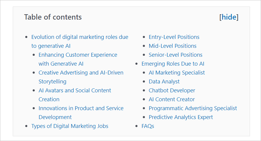
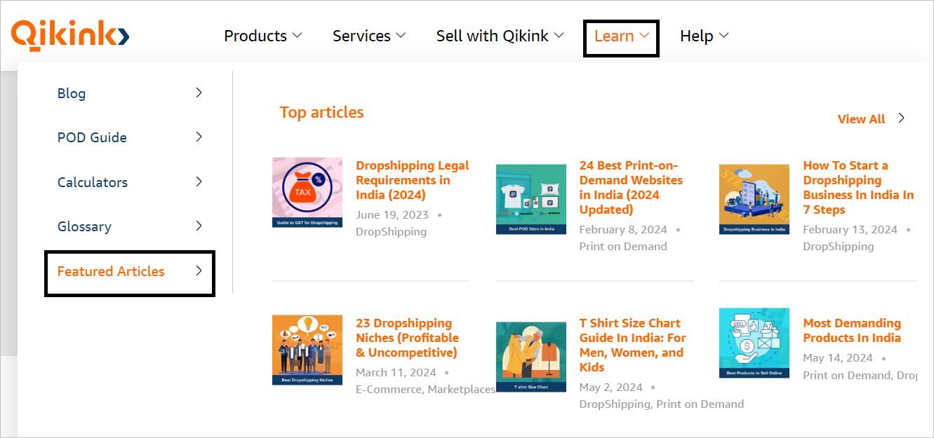
2. Use a Table of contents
The easiest way to improve the content experience of your blog articles is by adding a ‘Table of Contents‘ section.
However, make sure you’re using an HTML anchor to mark headings.
When a user clicks on a TOC link, the URL should update with a hash (#) followed by the ID.
Example: https://10pie.com/push-vs-pull-technology/#what-is-pull-technology
💡 Additional Tip: Use a two-column TOC table at the beginning of your article when the article has too many H2s and H3s:
- Multi-column TOC
- Expandable TOC
Here’s an example of a Two-column TOC:
Here’s an example of expandable TOC:

You can use ‘Ultimate blocks’ to create 2 or 3-column TOC sections in WordPress websites.
3. Use multiple ‘Table of contents’ when required
There is no fixed rule that you should add only one TOC section per article.
If your article is detailed and covers too many H2s and H3s, consider adding multiple TOC sections within your article.
This will improve the user experience and allow users to quickly find important insights from the page.
Here’s an example:

Another example from our blog content:
4. Use the same website navigation to your blog
Many websites, especially ecommerce sites make the mistake of creating dedicated header navigation for the main site and blog content.
For example, check Bewakoof.com’s blog header which includes only blog categories and sub-topics.
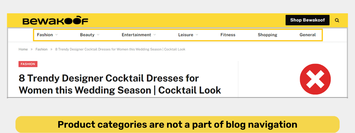
This might be good for users to find blog content by topics. However, this is also a missed opportunity to introduce your products/services to new readers.
The issue with this approach is that you’re not promoting your product/service offerings through blog content.
Also, your blog content doesn’t pass PageRank efficiently to your money pages because of too many click depths.
So, even if you get too many backlinks on your blog content, your money pages might not get the full benefits.
Here’s the right way of utilizing the main header navigation on your blog pages:
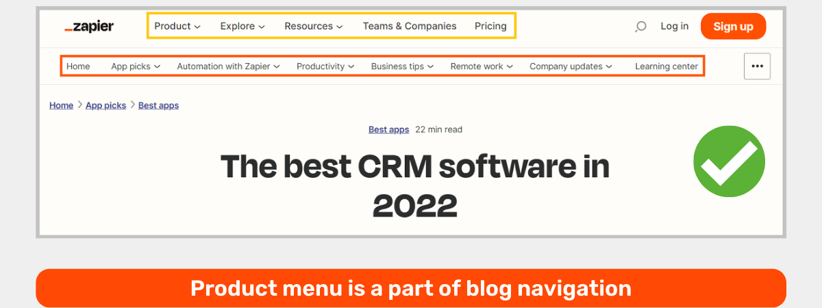
Even if you want to show a dedicated header section, you can always add a secondary header section just like the above screenshot of Zapier.
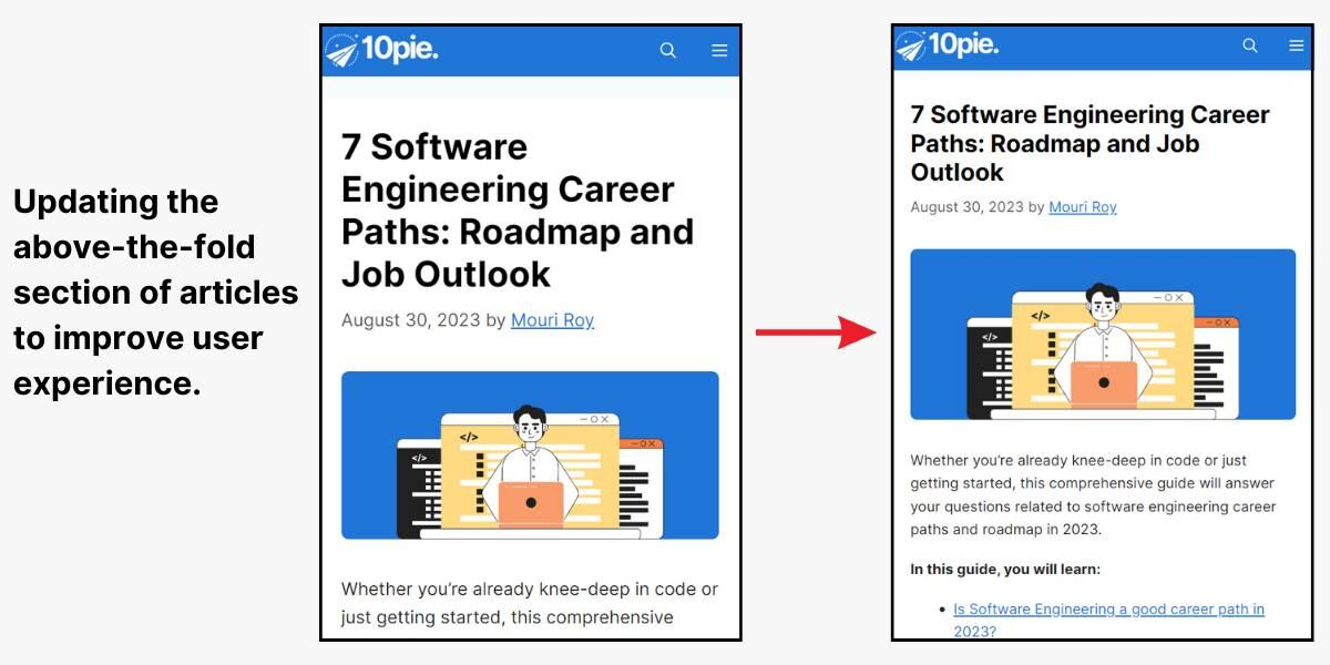
5. Display content in the above-the-fold section (check mobile and desktop versions both)
If you’re still using a large blog featured image that covers the entire Above-The-Fold (ATF) section, you need to redesign your blog layout.
It takes only 0.05 seconds for a user to form an impression about your website. And the first thing they notice is the Above-The-Fold (ATF) section.
This is why you should always optimize your ATF section for engagement and conversions.
First, ensure that you’re showing at least some portion of the blog content in the ATF section— double-check on Desktop and Mobile devices.
For example, check this ATF section for a blog article that shows nothing but the title:
On the other hand, I optimized my blog pages’ top section by showing more content to the top— this reduced the bounce rate by 12% within the next 28 days.
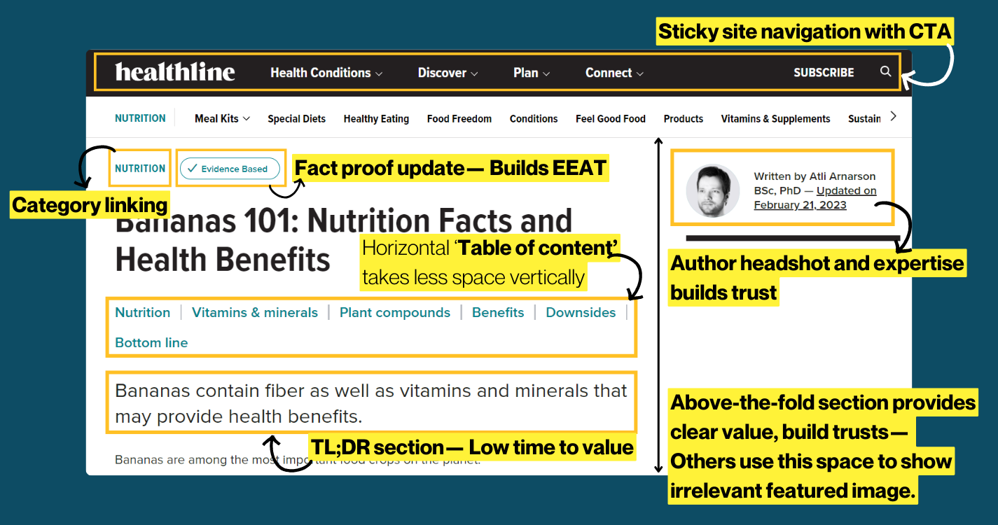
Another example (from Healthline) of optimizing your blog design layout in such a way that users will build trust, and get a TL;DR of the article without even scrolling down.
6. Include CTA in Above-The-Fold section of your blogs with minimized height
Whether you want more product sign-ups or to generate leads, this tactic can 2x your conversion from blog posts.
Let’s break it down 👇
In general, the “above-the-fold (ATF)” section of an article displays:
- blog title
- featured image
- and sometimes a short overview
An example:

There’s nothing wrong with this approach.
However, optimizing the ATF section for conversion can increase engagement and conversions.
An example:
Brainstation.(io) is an online training platform for students who want to build their career in tech.
They optimize their blog post by optimizing the above-the-fold section with a personalized lead generation form.
One of their blog posts, ‘How to become a machine learning engineer,’ offers a machine learning course inquiry form.
Here’s the blog post screenshot:

Adding a personalized lead generation form/messaging like this brings readers to the middle and bottom of the funnel.
In short: you’re turning blog posts into landing pages by optimizing the ATF section.
Action items:
- Find 3-5 blog posts with maximum organic traffic
- Optimize the above-the-fold section
- Ensure that the blog topic and lead generation form/messaging are super relevant
- Compare the performance of optimized blog articles with normal posts.
7. Use sticky CTA sidebar (desktop and mobile versions both)
If generating leads or signups is your primary objective from blog articles, then there’s no harm aggressively promoting your CTAs in the blog article without compromising the content experience.
Here’s how:
- Utilizing sidebars on desktop devices
- Utilize the footer section on mobile devices
Here’s an example of using sticky sidebar CTA for product signups:
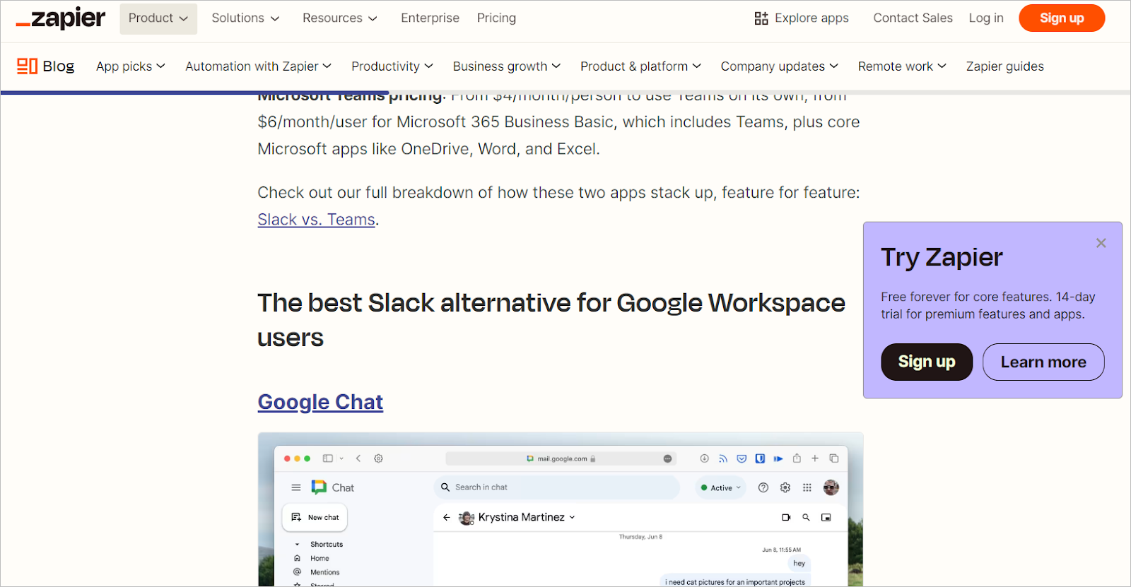
Another example from Zapier that displays a sticky CTA footer bar on mobile devices:
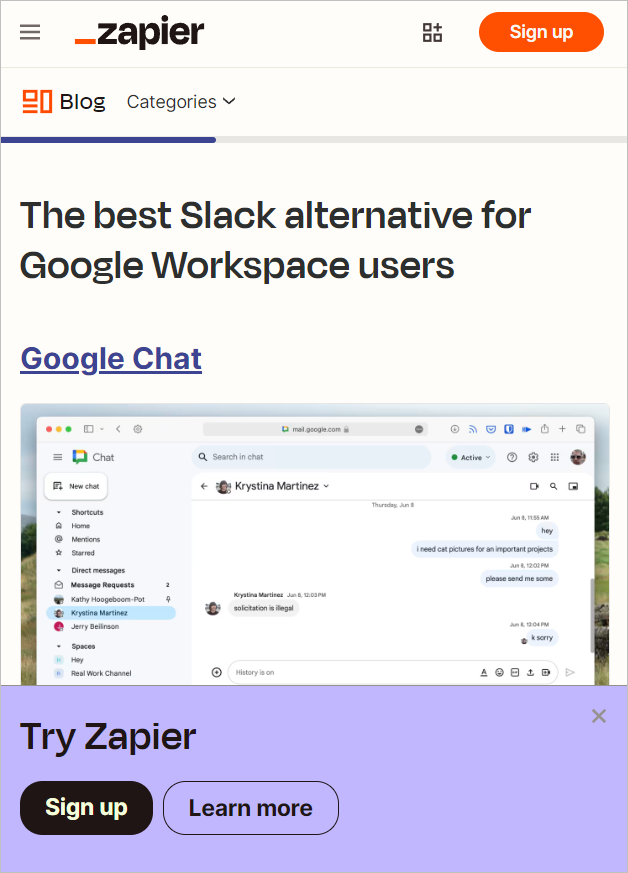
The only issue I am finding with the above screenshot is that the CTA is taking up too much space (height) in the footer which will reduce the user experience.
NOTE:
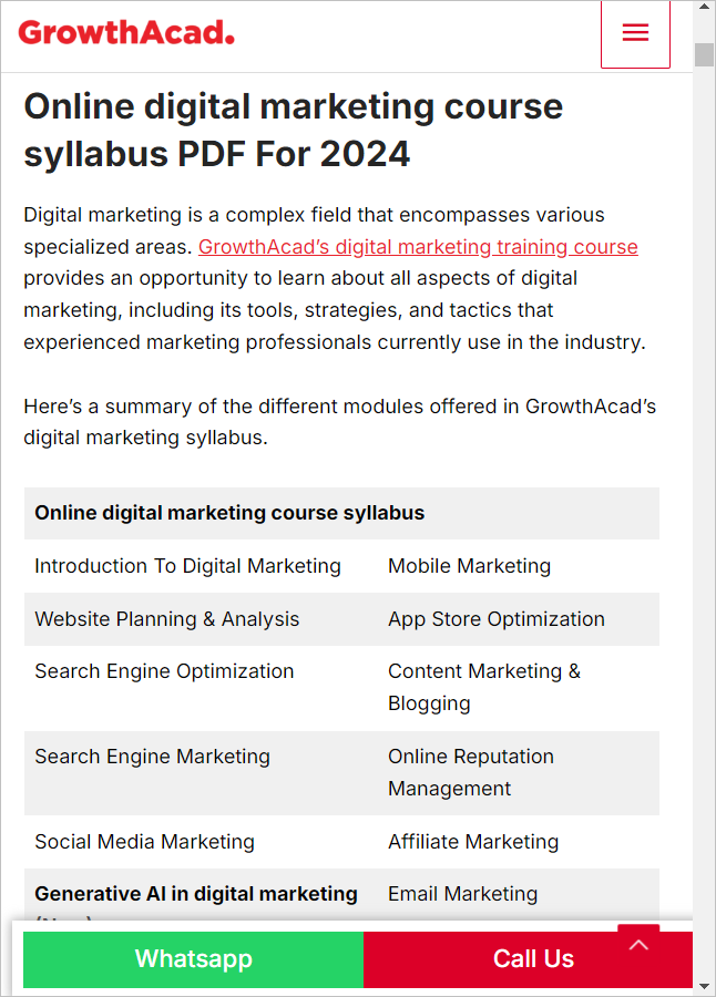
For businesses that require customer support access before selling products such as classroom courses, B2B products, etc., reduce the friction to contact as much as possible.
Don’t just rely on the contact page. Make the WhatsApp and Call Now buttons sticky on mobile and desktop versions.
An example from GrowthAcad:
8. Categorize your blog archive page
Why is it never too difficult to find a book in a library even if there are thousands of books?
It’s because of the categorization of books.
The same applies to content marketing.
Every book is categorized by topic/ industry/ popularity/ alphabetically etc.
The challenge with a site with hundreds/ thousands of articles is that old articles are hardly accessible by the user and the search engines as well.
Here’s an example:
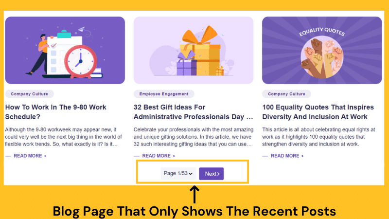
One reason is WordPress themes (mostly) display only recent articles by default.
And, it looks like this:
<< Previous 1 2 3 4… 87 Next >>
Challenges with this approach?
- Hard to find articles by topic and time.
- The crawler needs to follow lots of links to get to page 86 (If there are a total of 87 pages)
The better approach?
Categorize blog posts by category.
Example:
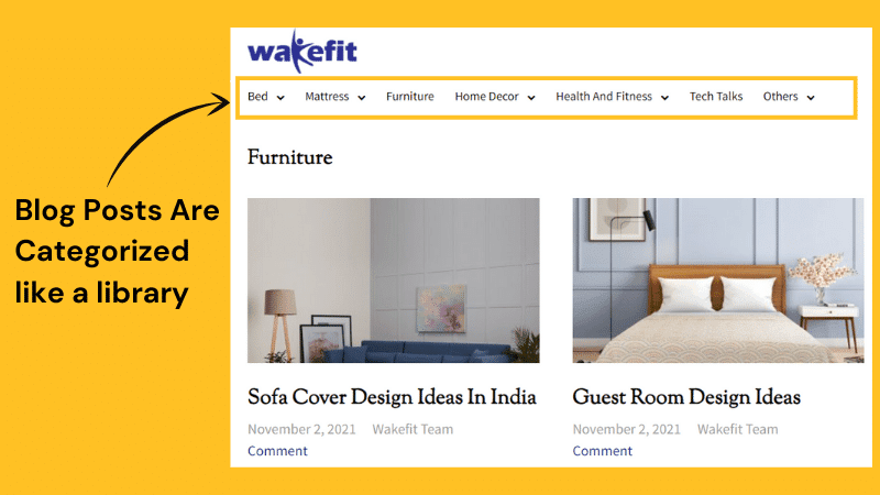
This will not only help readers to find the relevant content pieces but also help in crawling.
Do This Now:
1/ Make a list of all blog posts published.
2/ Create multiple categories.
3/ Now divide all the blog posts by tagging with the relevant category.
4/ Update the ‘Blog’ page and add all the relevant categories so a reader can easily navigate articles on different topics.
TIP: Feature BOFU or high-converting blog posts on the blog archive page.
9. Use longer pagination for a large number of blog articles
The site (greenhouse. io) has over 500+ articles, and the blog home page shows the latest 8 articles.
Yes, they have a filter to select a specific category. But there are some serious issues to fix.
Here’s what and how 👇
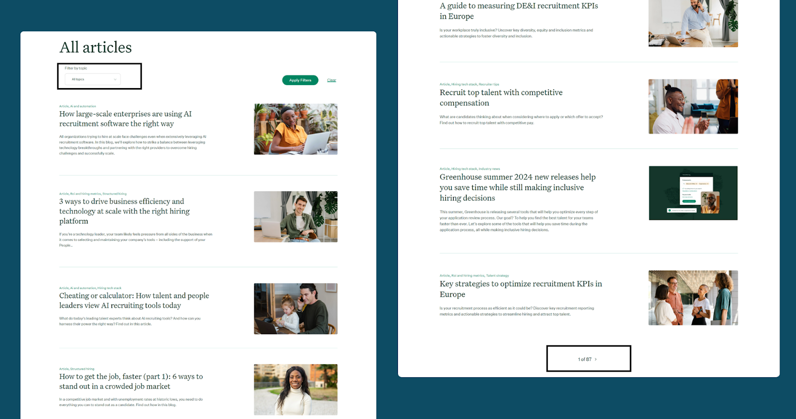
First, it is important to understand that: Web crawlers follow links from one page to find other website pages and so on…
In this case, the crawler has to follow 69 clicks to visit the oldest articles on the site.
Now, this is an issue.
Why? 👇
Because: the crawl depth is too much here, and this may hint to Google that old pages aren’t as important as the new ones.
Also, this type of pagination link is not user-friendly (since they have topic filters, it will be okay for users).
As Matthew Henry of Portent says,
“When content is buried hundreds of links deep, it sends a strong message to the search engines that you don’t think the content is important.
The pages will probably be crawled less often, if at all, & they probably will not rank very well.”
Better approach?
- Categorize your content inventory by topics, years, type, etc.
This way, you give crawlers a shorter path to crawl older posts.
The goal should be to make the crawl depth as low as possible without compromising the UX.
And, when it comes to pagination links, adding a midpoint link in the pagination can significantly reduce the crawl depth (even for a site with 2000+ pages).
👉 I recommend reading Mathew Henry’s experience and results on pagination: How Site Pagination and Click Depth Affect SEO – An Experiment.

Action items:
- Categorize your content (by topics, time, format) when you have at least 50-100+ pages
- Reduce crawl depth
- Adding a midpoint link is a great solution for larger sites
10. Basic blog UX principles that will take 3 minutes to execute
If you want to follow only one tip from this entire checklist to improve your blog UX, follow these elements:
- Choose the right font family
- Add enough spacing and a max of 900px screen width
- Pick font colour for readability and contrast
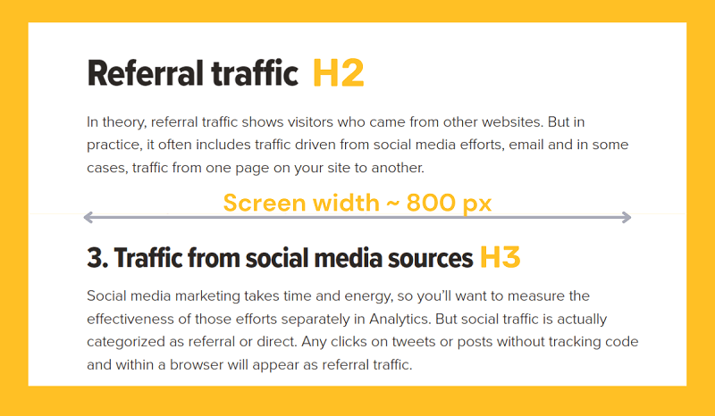
Common mistakes you’ll see in blog articles (mostly in B2B) are:
- Thin and small font size
- Poor selection of font family (difficult to read on mobile devices)
- Font colour is grey (hard to read)
- Not user-friendly font family (experimenting too much with font family to try to become creative)
- Blog width is too large/small
- No font size difference between sub-headings (H2, H3, H4, etc.)
Fix these basic elements and your blog UX will improve significantly.
11. Sticky header with CTA button on the top right
First, ensure that you’re using a CTA button in your header section with a contrast colour.
Next, make your header bar sticky on desktop devices (optional on mobile devices).
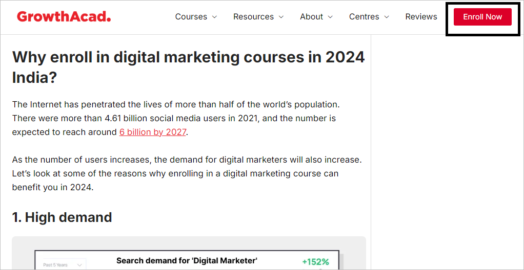
This technique draws more attention to your CTA, especially useful for promoting free offers like signups or consultations.
By keeping the CTA visible and eye-catching (with contrast colours), you increase the chances of user engagement and conversion.
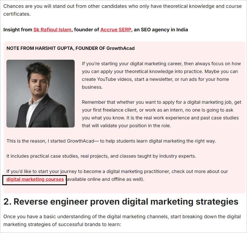
12. Showcase your product/solution using different text blocks that contrast with the background
When presenting your product or service within an article, create visually distinct text blocks with contrasting background colours.
This approach makes your offering stand out as readers skim the content.
Instead of simply inserting a CTA link, use custom text blocks with different colour backgrounds to showcase how your product or service directly addresses the problem discussed in the article.
Focus on demonstrating value and problem-solving capabilities rather than just listing features.
This strategy effectively captures attention and contextualizes your offering within the article’s topic, increasing the likelihood of user engagement and interest in your solution.
Let me cite an example:
- Blog topic: How to learn digital marketing
- Business offering: Digital marketing course
So, we created a text block to show how the company help students learn digital marketing with a CTA link.
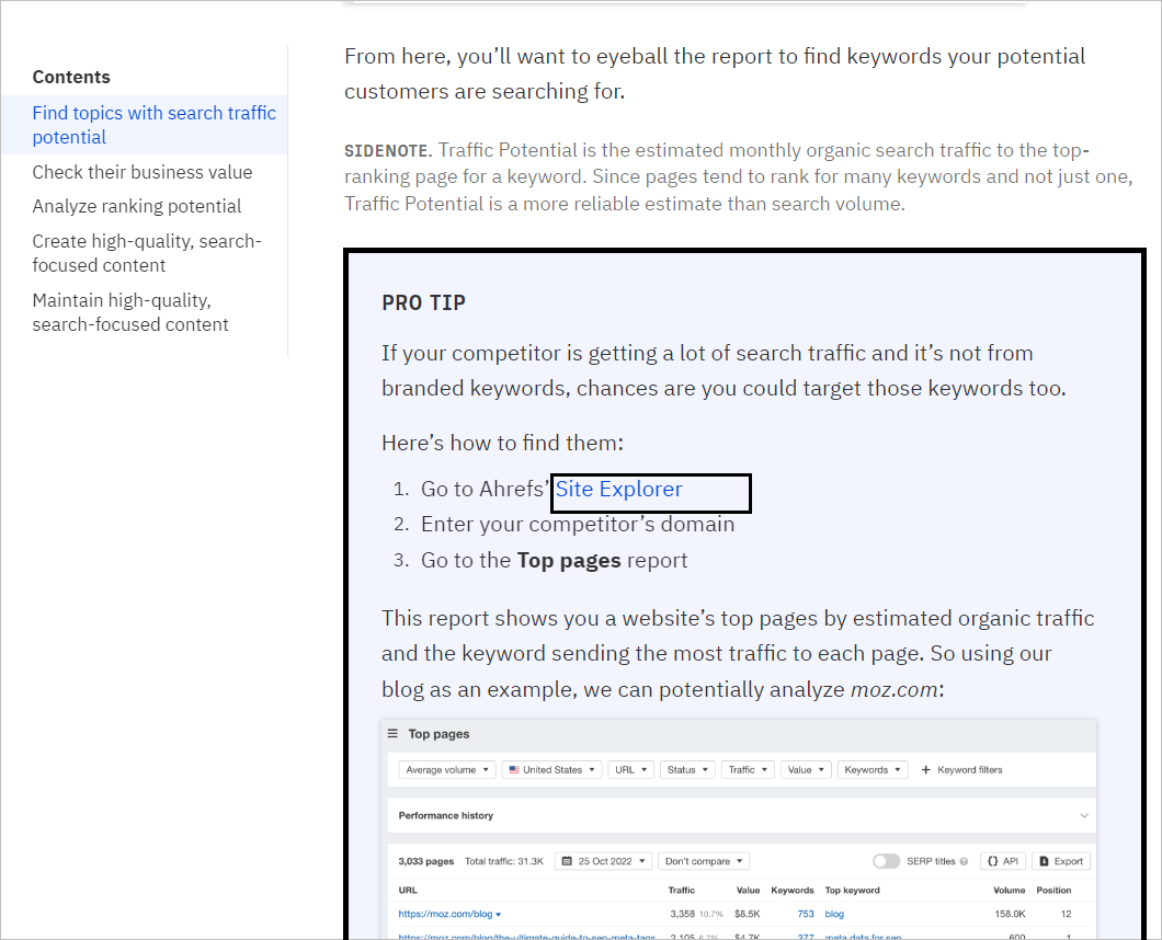
Another example from Ahrefs (SaaS):
- Blog topic: How to create an SEO content strategy
- Business offering: SEO tool
Instead of just promoting the product, Ahrefs has created a dedicated text block showcasing how their tool is helpful in doing competitor research.
This approach increases the chance of getting conversions from your blog content (specially from BOFU articles).
13. Include your high-converting or most important BOFU blog articles in the header and footer
This strategy involves finding the top-performing and high-revenue-generating pages and featuring them in the site’s header.
Here’s how I implemented it:
The first step was to identify the high-converting pages or pages that we wanted to rank at the top for target keywords. Using GA4 goal conversion, we could easily find those pages with high conversion rates.
At this point, we knew that if we could increase the number of visitors to these pages, we would generate more leads, considering their high conversion rates.
So, we planned to create a ‘Featured’ section in the header to include these top-priority pages.
Here’s an example:
This linking strategy has helped our website in two ways:
- It reduced the crawl depth and increased the PageRank of those pages—helping improve their rank positions and drive more traffic.
After almost 30 days, we noticed that 40% of the pages featured in the header section had improved their ranking positions.
This led to an increase in the number of leads generated by 6%, as more users were clicking on those featured pages from the header.
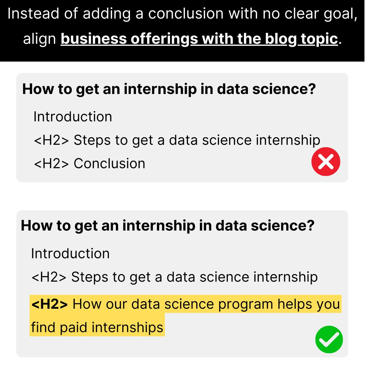
14. Replace conclusion with product-led content
Long back I stopped adding ‘conclusion’ in blog articles (mostly) for my clients.
Instead, I instruct my content writers to end informational blog posts by aligning business offerings with the blog topic.
Here is an example:
Consider, an online data science training institute (say the company name is: Company X is writing a blog article on the topic “How to get an internship in data science.”
Now, instead of ending the post with a generic ‘conclusion’, I prefer aligning the business offerings with the search intent.
Here’s how:
Here, the reader wants to find ways to get an internship in data science. So, one possible way to end the article is by adding the following heading (H2):
<H2> How Company X’s data science training program helps you find paid internships
Here, the goal is not just to promote the business offerings but also to help readers align the current blog topic with the offerings.
15. Attach downloadable materials near the beginning of the article or just after the table of contents
If your article offers any downloadable material, place it near the beginning of the article or just after the TOC section.
From our research (unfortunately, we don’t have supporting data), we found that adding downloadable materials near the beginning of the article drives more conversions compared to when placed at the bottom of the page.
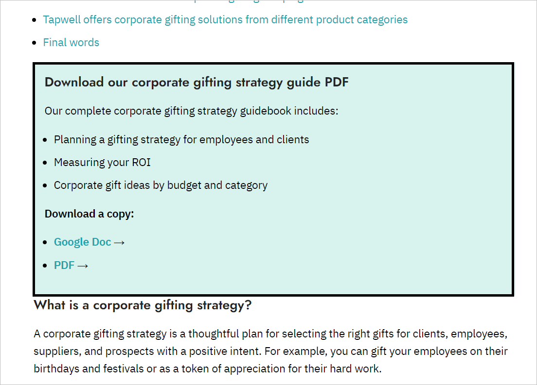
Tip: Use a text block with a different background colour for any section of the article where you want users to pay attention, such as CTAs, product mentions, etc. Just don’t overdo it.
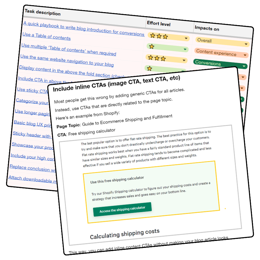
16. Include inline CTAs (image CTA, text CTA, etc)
Most people get this wrong by adding generic CTAs for all articles.
Instead, use CTAs that are directly related to the page topic.
Here’s an example from Shopify:
Page Topic: Guide to Ecommerce Shipping and Fulfillment
CTA: Free shipping calculator

This way, you can add inline content CTAs without making your blog article look promotional.
17. Create listicle articles with CTA to drive commerce conversions
One of the most effective blog content strategies for eCommerce brands is list posts (a.k.a listicle articles) for product suggestions.
For instance:
If you’re selling home furniture online, some possible blog content ideas are:
- 10 best chairs for remote employees
- Top 10 standing tables of 2023 (under budget)
- 7 best furniture accessories to buy
Listicle posts can work well for eCommerce brands in terms of traffic and conversion.
One key reason is:
Buying intent for product suggestions/lists is high. In fact, these types of posts allow you to promote your own products without being salesy.
Some examples:
Wayfair(.com) is a great example of creating listicles to drive traffic and promote their own products via internal links.
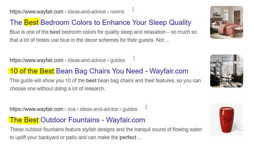
When you look at the page structure, you’ll see a similar pattern for all ‘Best X’ type posts.
Here it is:

In fact, every product in the listicle is linked to either category or product pages.
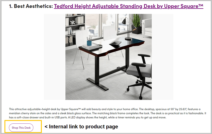
This helps in:
- Passing the PageRank from articles to transactional pages
- Driving conversion by directing people to products
- Satisfying user intent
Action items:
Start listing all important (high revenue, trending, etc.) product categories
Perform keyword research to find queries like best X, top X of 2023, etc.
Study the search intent. Are the ranking results blog posts/category pages/product pages?
Publish the page with internal links to related product categories or product pages
Use descriptive link text and CTA buttons to stand out from the text
Don’t forget to include the product image to give users a preview.
Tip: Instead of adding CTA text like ‘Buy product X’ or ‘shop product X,’ you can try with CTAs like ‘check the latest price of X.’ This reduces the friction for users to click the link.
18. Make the content more organized and easy to digest for the readers (say no to long paragraphs)
Improved information structure = Improved content readability
The way you create content briefs and structure the information on your page matters a lot for content readability and UX.
Here’s a real example:
I searched with the keyword ‘Data science job types’
This article is ranked within the top 10 positions.

There are 10 data science job types mentioned in the article and the structure of each job path looks like this:

This might seem normal, as most articles follow a similar content structure— but some small improvements to this structure can lead to huge content readability improvement.
Here’s how I’d structure each job path:
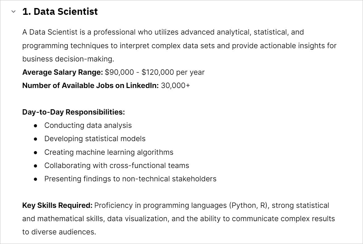
The information might be similar in both cases. However, the categorization of each job title (by salary, skills, roles, and jobs) is what the reader actually wants to know about.
Action items:
- Find opportunities to make the content more organized and easy to digest for the readers.
- Identify the search intent and focus on highlighting the most important information using bullets, subheadings, bolded text, etc.
MY SUGGESTION: While creating content briefs, give this detailed structure for each section— this makes the writers’ job much easier.
19. Put CTA text links in a single paragraph or at the end of the sentence
Sometimes we negatively impact the conversion rate from blog posts by putting CTAs in the wrong place.
If you’re putting CTAs such as ‘contact us, ‘get a demo’ within a paragraph, then the CTAs may easily get ignored by the readers.
Better approach?
Add important CTAs in a single sentence as this will stand out from the paragraph and get the readers’ attention.
Here’s an example →
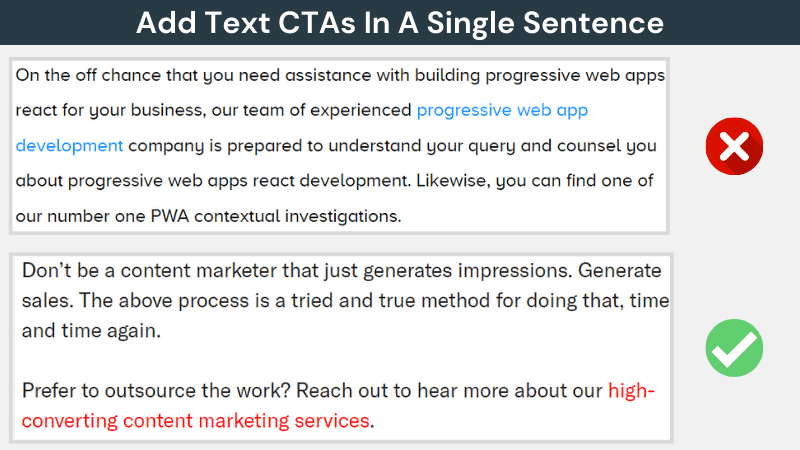
“Many users will scan posts and not pay attention to links within paragraphs, or even read paragraphs. Using a simple sentence with a text link CTA will stand out.
For maximum points, including one of these at the end of every post, and 1-2 more mid-post where it makes sense.”
Note: I learned about this idea from Ross Hudgens (Founder at SiegeMedia).
20. Reduce time to value by adding a TL;DR section
‘Search Engine Watch’ provides a 30-second summary at the beginning of each article.
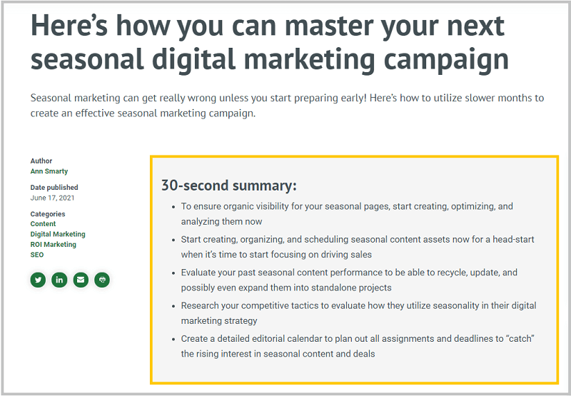
This helps the readers get a quick overview of the article and find the important information faster.
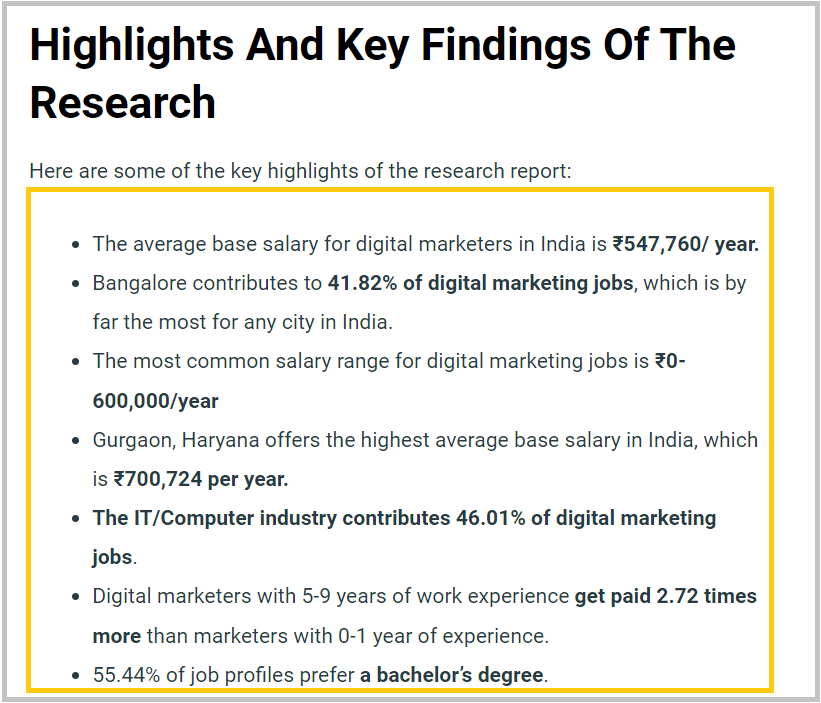
Example: Data-Led Content
Publishing original research-based articles or a statistics page? Then consider this idea.
Last year I published a data-driven article on digital marketing jobs report. These types of articles have lots of interesting data points and findings.
Therefore it is important to create a section at the beginning of the article that highlights all the key findings from the research.
Example: Affiliate blog content (listicle)
If you’re publishing listicle articles (specially on an affiliate site), consider adding a quick TL;DR of your list by linking to each CTA URL.
This way, you increase your chance of a high number of clicks per article, as users don’t need to read the entire article to find the product URLs.

Benefits?
- First, this helps users to get the key research findings within seconds.
- Second, bloggers and journalists can find interesting statistics to pick as a reference for their articles.
21. Product-led content approach for blog product businesses
What it means:
“Content where the product is woven into the narrative to illustrate a point, solve a problem, and/or help accomplish a goal.” – Dr Fio Dossetto.
Here’s an example from Shopify:
Shopify published an article about “How to Start Dropshipping in India.”
Users’ goal: To learn the benefits of dropshipping and its process.
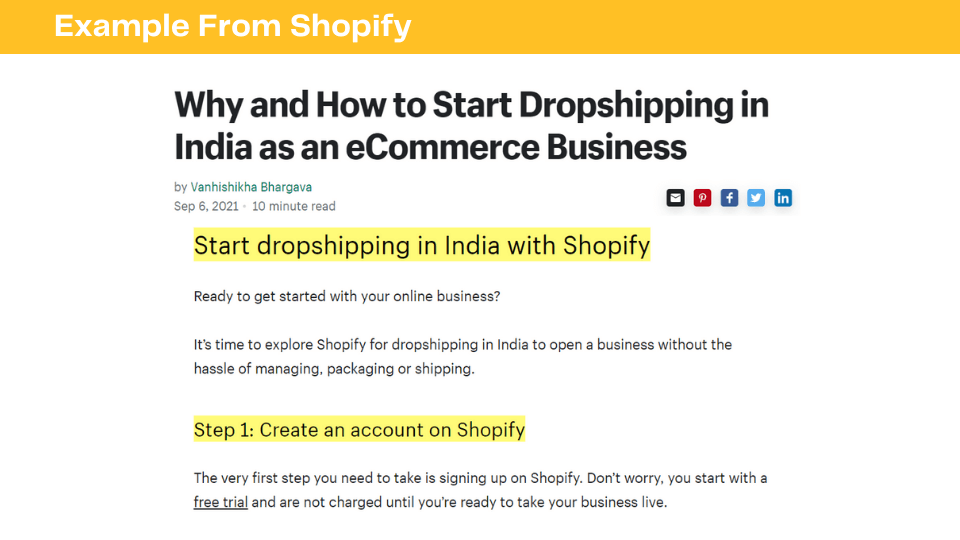
Here, Shopify didn’t just share the process to start dropshipping.
Instead, they have turned their product (eCommerce platform) into a solution to teach about the dropshipping process.
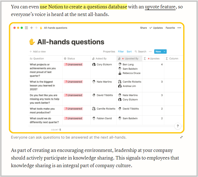
Another example from Notion:
Notion publishes a lot of helpful articles for startups.
One of them is about “How to improve knowledge sharing within your startup”, where they have presented Notion as a solution by adding:
- Product screenshots
- GIFs
- Product features, etc.
This is what it looks like:
The goal here should be to turn your product/service into an important part of the content.
22. Write product-led content for service business
Product-led content isn’t only applicable to SaaS businesses. Even service businesses can achieve high conversion rates with this approach.
Here’s an example from GrowAndConvert (a service business): One of their popular articles is about “SaaS content marketing.” In the traditional approach, you’d see articles sharing strategies for SaaS content marketing or some marketing examples of brands. But here, the GrowAndConvert team did a great job by turning their service into part of the solution.
Here’s how:

These articles share strategies and case studies where they got results for their clients using the same strategies.
This informs the reader that the brand is a content marketing agency and works as social proof for its work.
The key message here is: Try to integrate client case studies with the content.
For example → If the article is about product positioning, then share strategies for product marketing and how the same strategies helped your clients.
23. Use descriptive link text (you link text doesn’t have to be just 2 words— “click here”)
Always link directly to relevant resources you mention in your content. Specifically:
- When you reference a program, event, or initiative, insert a hyperlink to its official webpage.
- If you mention a faculty member, staff, or any named individual within your organization, link their name to their bio or profile page.
- For any concept, term, or entity that has a dedicated page on your website or a reliable external source, add a hyperlink the first time you mention it.
- Double-check all links to ensure they’re working and lead to the correct pages.
- Use descriptive anchor text for your links, avoiding generic phrases like “click here” or “read more.”
Remember: Your goal is to make information easily accessible. Don’t assume readers will search for additional details— provide direct pathways to related content sources whenever possible.
Example of descriptive anchor text:
- Not recommended: Read this to learn the benefits of cloud computing
- Recommended: Check out this guide and learn the benefits of cloud computing
- Recommended: For any technical article, it is recommended to cite research papers from Google Scholar and cite them in the content.
TIP: Always use descriptive text for your links, not the URL itself.
Recommended: Learn more about our writing program.
Not recommended: Learn more at https://steinhardt.nyu.edu/writing-web
24. Take blog content feedback by adding a feedback widget
The best way to know whether your content is helpful or not is by getting feedback from real users.
To collect user behaviour data, you can add a small feedback widget on your blog articles at the bottom.
An example:

This simple widget will help you know the quality score of your articles over time. You can install this ‘Was This Article Helpful?’ WordPress plugin to activate the widget.
25. Optimize your content for QUALITY ACTIONABILITY
“Create QUALITY content”😕— Stop this generic SEO advice without any context.
It’s subjective to define content quality.
One element that makes your content stand out from most of the mediocre pages is making your content as actionable as possible.
That means: instead of telling what it is and why it is important, show the readers how it’s done.
See the below image screenshot (a content snippet taken from a Shopify article):
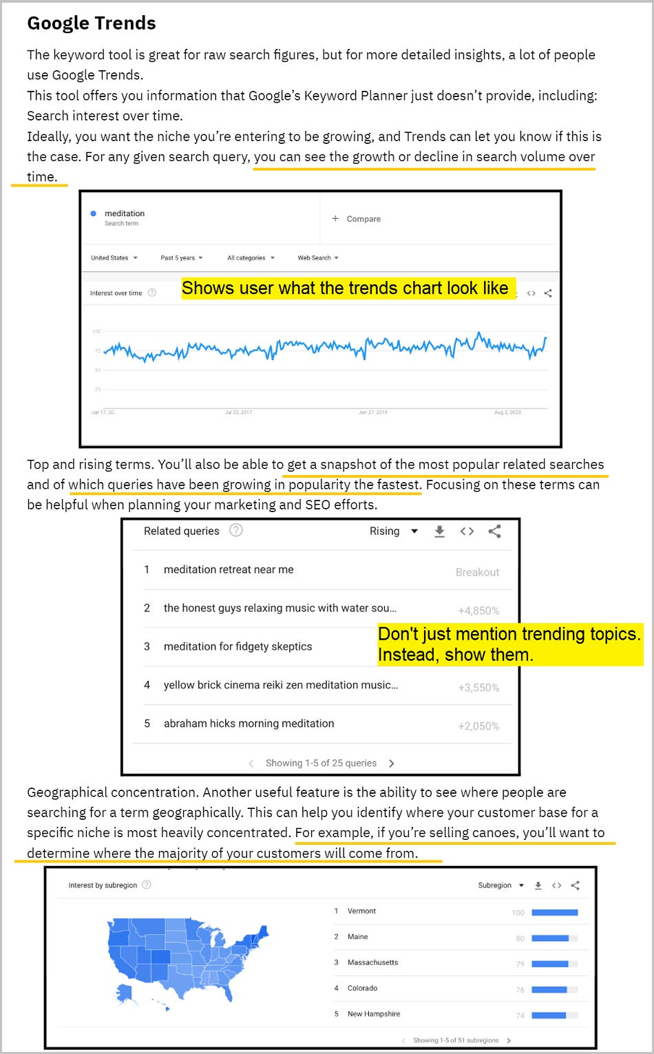
Notice how the content focuses on not only giving accurate advice but also helping readers visualize the results or steps.
Here’s another example below:
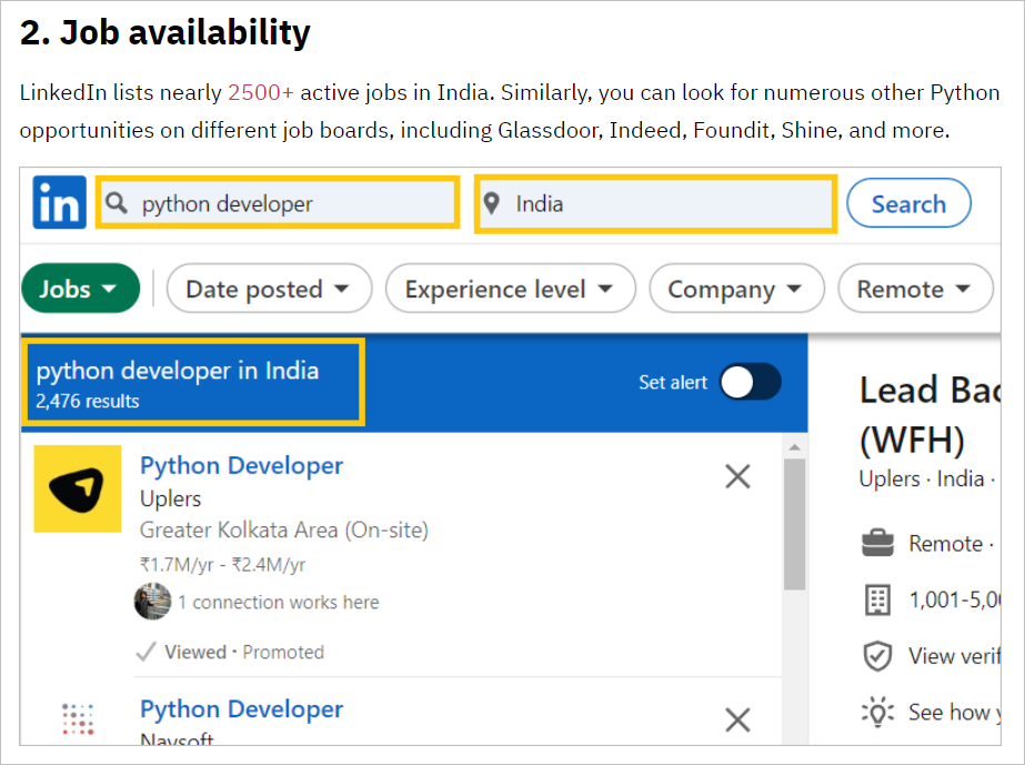
While highlighting the job availability of Python developers on LinkedIn, it shows the screenshot of the actual data from LinkedIn— this not only makes it actionable but also more trustworthy content.
Adding simple screenshots of steps, creating process GIFs, and even simple graphics (flowchart, diagram, etc.), can make your content 10x more ACTIONABLE.
👉 Give this simple instruction to your content team: Don’t just write about what to do and how to do it.
26. Make your content trustworthy by removing opinions
Readers want information that is trustworthy and credible.
Train your writers to not share their opinion (unless the blog topic demands an opinion view).
Want to justify a point? Add statistics, data, and research points to justify your claims.
Example:
Not recommended: I think X is the most important skill needed to become a data science engineer.
Recommended: X is one of the top three skills to become a data science engineer, as per McKinsey’s survey on 1000+ employers.
Another example:
Not recommended: Data science is one of the most in-demand jobs in the technology field.
Recommended: Data science is one of the most in-demand jobs in the technology field.
In fact, there are 183k+ US-based data science jobs available on LinkedIn.

(This screenshot validates the claim made by the writer)
27. Reduce the fluff from the introduction
One sureshot way to improve the UX and fulfil users’ needs faster is by adding the most important information in the above-the-fold section.
Take the below example of Ahrefs.

Readers don’t need to skip 200 words of generic introduction to get an overview price range for retainer basis and hourly basis.
TIP: While creating the content outline try to put the important headings near the beginning. The faster you can provide readers with the required information, the better the user experience.